Lab 1: Understanding Textual Structures with Markdown
The First Lab
Some Thoughts
What I like initially and immediately about Markdown is the simplicity of the program. I do most of my writing in Microsoft Word and one of its drawbacks, simply visually, is that it is cluttered, especially at the top of the page. I write as a hobby in my free time and I have downloaded several programs that rid me of excess formatting options and buttons to better be able to focus on the words that I am putting forth onto the page. It reminds me of some messaging apps that I use which use the same lingo for italics and bold.
At the same time, the learning curve for the program - one of its drawbacks, at least initially - enforces, perhaps artificially, this feeling that what I write must be strictly technical and polished. With the black background it looks to me like I have pulled up the command prompt option on my laptop (or more likely, when I watched my dad pull up the option to fix something that I had done wrong on my first laptop, and I thought he was a wizard when he knew exactly what to type) or am working with a piece of code on my tumblr blog. I keep expecting to have to put in a piece of html coding. I’m glad I don’t. Those take so much more time than just throwing in a few asterisks.
While I did earlier mention the visual simplicity of the program, the split-screen aspect showing me both the plain text and what it looks like formatted is a little distracting. I’m constantly checking back and forth to make sure that I haven’t done anything that causes all of the formatting to become strange.
Some Pros and Cons
AFFORDANCES
- I don’t have to hassle with whichever blog platform this particular class has decided to use. Usually they are relatively similar, but usually they are also annoying.
- Since I do a lot of digital writing, it is interesting to know at a basic level how it works, like how it compares to Word.
- It’s something new I can put on my resume.
LIMITATIONS
- Pulling up the syntax list again and again for the less intuitive code markers.
- It’s not as easy to turn in as just posting something to a class blog. I’m still trying to figure out what I’m supposed to do for that.
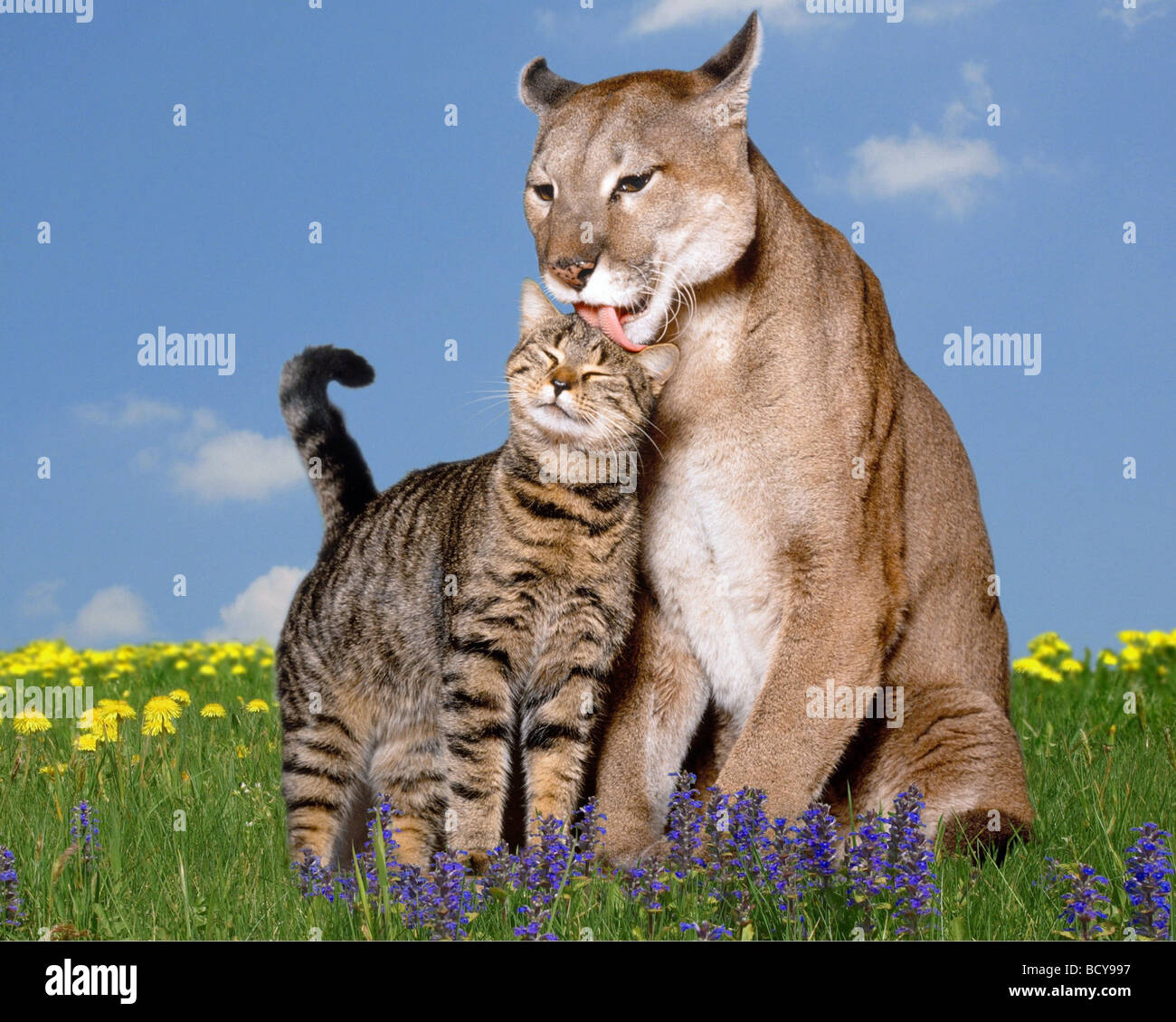
To practice some other syntax things, here’s an odd stock photo that I found a few weeks back.

FIELDBOOKS
