Deciphering Ariel
Ariel
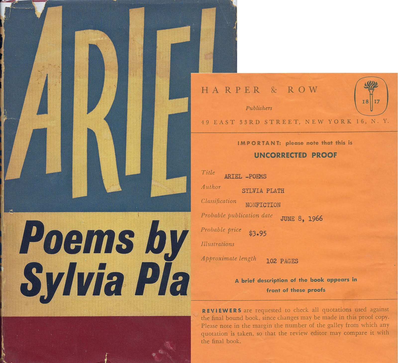
A year or two ago, I picked up an edition of Sylvia Plath’s Ariel in a used bookstore in Niantic, Connecticut. Collections of Plath’s poems, in my experiences, are difficult to find used and cheap, so I snatched up this copy without much thought. Upon further examination, the Ariel I bought was the 1965 edition published by Harper & Row.

The codex is thin and compact; the cover is minimalistic and austere, with an off-white background and black, purple, and orange text; the hypertext emphasizes mortality and death, as these were Plath’s last poems she wrote before her suicide: “In these poems, written in the last months of her life, and often rushed out at the rate of two or three a day, Sylvia Plath becomes herself, becomes something imaginary, newly, wildly, and subtly created…” This quote undoubtedly romanticizes her death and glamorizes these poems as the epitome of creation, because they were fueled by pain and depression. They seem to be exploiting her death to sell copies of this book.
“ARIEL” is the main point of focus on the cover, following “POEMS BY SYLVIA PLATH” and “ROBERT LOWELL,” interestingly enough. Advertising Lowell’s introduction seems to be yet another a marketing ploy to generate both revenue (since he was popular) and meaning (since his work influenced her work). The back cover is also minimalistic, with quotes from reviewers from The Reporter, The Critical Quarterly, etc. They mention “legend,” “myth,” “marvelous[ness].” One even calls her poetry “a murderous art.” The reviewers and the publishers capitalize on her death for this posthumous release. There is undoubtedly a stigma around suicide for this time period, but the art world and capitalism uses death and suicide for their profit.
The pages within the text are obviously pages of poetry. They follow a basic formula: title centered and in all caps, stanzas separated by spaces and left-aligned. An index and foreword prefaces the poems.
The slenderness of the volume, the aesthetic of the cover, and the content within the book are indicators that Ariel is a work of poetry that is meant to be taken seriously; it does not need elaborate decorations or embellishment; it is a work of death with poetic merit. All one has to do is look inside and read.
##Other Editions
As noted in the embedded picture above, this specific edition of Ariel has the most text on the cover, which helps the reader understand the importance of this book as a posthumous collection of poetry. The other editions have a lessened focus on text and an increased focus on visual aesthetic. The very first edition of Ariel was published by Faber and Faber in 1965:
This design feels less serious; it plays with some textual aesthetics and color palettes standard of 60s mainstream culture. It feels like a bold celebration of art rather than a somber eulogy of death. There are no references to her suicide or Robert Lowell: one must take this at face-value, as an object of art that the reader can evaluate with their own perspective.
Editions like this 1968 copy printed by Faber and Faber seem to employ images and motifs within Ariel:

One thinks of “Tulips,” “Poppies in October,” “Poppies in July.” The emphasis on red aligns with her use of the color throughout the collection, and thus emphasize her themes around passion, mortality, etc.
I do not know what is on the back of this edition, but so far there seems to be an inherent beauty that the designer is trying to emphasize - but also an ephemeral one, as signified in the singular drooping tulip. Life and death is once more evoked here.
Perhaps the most complex edition of Ariel is the 2010 UK edition published by Faber and Faber:

One sees an intense confluence of motifs from the collection, including the ocean, the moon, bees, flowers, womanhood. This cover is modern and significant; it is elaborately designed to attract awe and attention. But the focus here is not on the creativity that derives from death, as is the case with the first edition I analyzed; rather, the wonder of the text comes from the words and metaphors within. The emphasis is her poetry, not her life or death.
I also think it is important to note that the 20th century editions of Ariel were corrupted by Ted Hughe’s hand - they included arrangements of poems he thought were best, or most effective. Plath herself organized the collection in a specific way, which one did not see restored until the 21st century. Ted Hughes, of course, was abusive and overall a terrible person; his involvement with his ex-wife’s poems after her death show a level of control and exploitation, which I think one can see manifested in the ways that these editions were marketed across the years.
Conclusion
By focusing on the various covers of a specific text, one can understand what ideals the designer and the publisher is trying to convey and how they are trying to market it. This specific analysis draws on Station 2 of this lab, where we looked at various editions of Morse’s Geography. It is easy to ignore the hypertext of a book and to focus solely on its artistic contents; but, as we have seen in readings like “Baxter’s Procrustes” and the letters of Jane Austen - format and design matter. They influence the ways in which readers experience the text. What if this collection were thicker? What if the textual format were more experimental or ornamental? How does one’s experiences change when they read the 2010 Faber and Faber edition of Ariel as opposed to the 1965 Harper & Row edition?
To answer that last question: a person like Jane Austen might take the 1965 edition more seriously; it is thin, simplistic, and concise in its physicality. The 2010 edition might be too superfluous, or it might be too distracting from the text at hand. A modern reader, however, might appreciate the thoughtfulness of the cover art, and might find the simplistic design of the 1965 edition too boring.
Essentially - books are produced for specific purposes in specific time periods. While there are variations of perception from person-to-person, the cultural meanings of texts change based on sociocultural contexts.
FIELDBOOKS